Soft Autumn: Complete Color Palette, Clothing, Makeup, Hair, and Style Guide
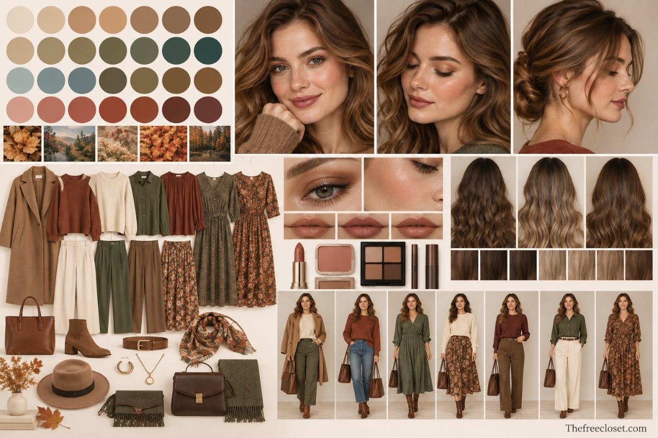
Soft Autumn is a muted, warm-neutral color season defined by soft, earthy, and slightly warm shades. Colors such as sage, olive, camel, warm taupe, terracotta, dusty peach, cocoa, and cream tend to complement this palette, while stark black, bright white, icy pastels, and highly saturated colors can appear overpowering.
What Is Soft Autumn?
Soft Autumn is one of the sub-seasons used in expanded seasonal color analysis. It sits close to Soft Summer, which explains why the two palettes can initially be difficult to distinguish.
Both favor low saturation and blended colors. Their primary difference is temperature: Soft Autumn leans warm-neutral, while Soft Summer leans cool.
A simple way to understand the Soft Autumn palette is through three characteristics:
| Characteristic | Soft Autumn tendency | What it means when choosing colors |
| Temperature | Neutral-warm | Choose earthy warmth rather than icy or blue-based shades |
| Chroma | Muted | Choose dusty and softened colors instead of vivid ones |
| Value | Mostly medium | Mid-depth shades are often easier than extreme lights or darks |
| Contrast | Usually low to moderate | Blended combinations tend to work better than stark contrast |
The most important characteristic is usually softness. A warm color can still be too intense for Soft Autumn if it is extremely bright or saturated.
Think of the difference between bright orange and muted terracotta. Both are warm, but terracotta has the subdued quality that fits the palette more naturally.
How to Tell If You Are a Soft Autumn
You may be a Soft Autumn when your overall coloring looks blended, muted, and gently warm rather than bright or highly contrasting.
Hair, skin, and eyes do not have to match one particular combination. Seasonal analysis is more useful when you consider how your complexion responds to different colors instead of attempting to identify your season solely from hair or eye color.
Common Soft Autumn coloring can include warm-neutral or olive skin, warm or neutral brown hair, softer golden or caramel tones, and hazel, brown, green, gray-green, or similarly muted eyes. However, these characteristics are clues rather than definitive tests.
Try a simple color comparison
Stand in indirect natural daylight with minimal or no makeup and compare fabrics close to your face.
Try these pairs:
- Cream vs. pure white
- Cocoa brown vs. black
- Sage vs. emerald green
- Muted terracotta vs. bright orange-red
- Warm taupe vs. cool gray
- Dusty peach vs. vivid coral
Pay attention to your face rather than the fabric.
A more harmonious color may make the complexion appear more even and keep attention on your facial features. A less harmonious shade may visually dominate your face or emphasize shadows, redness, or unevenness.
Color analysis is ultimately a styling framework rather than a medical or scientifically definitive classification. Even professional systems can differ at the boundaries between seasons, so direct comparison is more useful than treating a checklist as an absolute diagnosis.
The Soft Autumn Color Palette
The easiest way to build a Soft Autumn palette is to imagine colors that have been softened with gray, brown, beige, or earthiness.
Instead of clear green, choose sage.
Instead of brilliant orange, choose terracotta.
Instead of bright pink, choose dusty warm rose.
Instead of pure white, choose cream or oyster.
Best Soft Autumn colors
Some of the most useful color families include:
| Color family | Good Soft Autumn shades |
| Neutrals | Cream, oatmeal, mushroom, camel, warm taupe, cocoa |
| Greens | Sage, moss, olive, khaki, muted forest green |
| Reds | Brick, muted rust, cinnamon, terracotta |
| Pinks | Dusty peach, warm rose, salmon-beige, muted coral |
| Blues | Dusty teal, muted turquoise, soft petrol blue |
| Yellows | Muted mustard, ochre, wheat, antique gold |
| Browns | Caramel, hazelnut, tobacco, cocoa, soft espresso |
| Purples | Warm muted plum, brownish mauve, softened aubergine |
Palette boundaries are not completely standardized between color-analysis systems. For example, one system may classify a particular muted plum as Soft Autumn while another places it closer to Soft Summer. Focus on the underlying combination of mutedness and gentle warmth, rather than treating individual swatches as rigid rules.
Best Neutral Colors for Soft Autumn
Neutrals can make a particularly noticeable difference because they often cover large areas of an outfit.
Classic black and brilliant white create one of fashion’s strongest contrasts. Soft Autumn coloring generally benefits from something quieter.
Instead of black, experiment with cocoa, espresso brown, deep olive, warm charcoal-brown, or dark taupe.
Instead of pure white, try oyster, ivory, oatmeal, ecru, or creamy beige.
Instead of cool gray, look for mushroom, greige, stone, or warm taupe.
Camel can also work as a versatile wardrobe anchor because it provides warmth without requiring a highly saturated color.
A practical capsule wardrobe could therefore begin with cream tops, warm-taupe trousers, an olive jacket, camel outerwear, cocoa leather accessories, and a few muted accent colors.
Soft Autumn Greens
Green is one of the easiest families to explore within this palette.
Look toward vegetation rather than gemstones: sage, dried herbs, moss, olive leaves, eucalyptus, khaki, and softened forest shades provide useful visual references.
Bright emerald and highly saturated grass green can create too much intensity. Very blue-based greens may also feel disconnected from the palette’s underlying warmth.
Olive is particularly useful because it can function almost like a neutral. Olive trousers, jackets, knitwear, handbags, and footwear can pair naturally with cream, camel, terracotta, dusty peach, and warm brown.
Soft Autumn Reds, Pinks, and Oranges
Warm colors work best when their intensity is reduced.
For red, consider brick, cinnamon, muted tomato, rosewood, and softened rust rather than a brilliant primary red.
For pink, look toward dusty warm rose, muted salmon, peach-beige, and subdued coral instead of bubblegum pink or icy fuchsia.
Orange is easiest when it becomes earthy. Terracotta, clay, copper-brown, and muted pumpkin are generally more consistent with Soft Autumn than fluorescent or highly saturated orange.
This principle is useful when shopping: if a color seems almost correct but overwhelms your face, look for the dustier or browner version of the same hue.
Soft Autumn Blues and Purples
Being an Autumn does not mean giving up blue.
The difference lies in choosing blues that have enough softness or warmth to integrate with the rest of the palette. Muted teal, dusty turquoise, softened petrol, and subdued blue-green are useful possibilities.
Purple can be more challenging because many purples are strongly cool. Browned plum, warm muted mauve, and subdued aubergine can sometimes work, particularly when combined with warmer neutrals.
If a blue or purple looks icy, electric, or exceptionally clear, it will generally sit farther from the core Soft Autumn palette.
Colors Soft Autumn May Find Difficult to Wear
The hardest colors are typically those that oppose the palette’s defining characteristics.
That means very bright, very cool, or extremely high-contrast colors can be more difficult near the face. Common examples include optic white, jet black, neon shades, electric blue, icy lavender, vivid fuchsia, and intensely saturated jewel tones.
That does not mean these colors must disappear from your wardrobe.
If you love black, for example, wear it farther from your face in trousers, skirts, footwear, or bags. Alternatively, soften a black top with a camel jacket, warm scarf, muted jewelry, or makeup that restores some warmth.
Personal style should not become subordinate to a seasonal palette. The palette is most useful as a decision tool, not a rulebook.
Soft Autumn Outfit Combinations
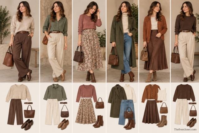
Soft Autumn outfits usually look especially cohesive when they maintain low to moderate contrast.
Instead of pairing the lightest possible shade with the darkest possible one, combine neighboring depths and related earthy colors.
Useful combinations include:
Sage + cream + camel
A reliable everyday combination with gentle warmth and little visual competition.
Terracotta + warm taupe + cocoa
A richer combination suitable for autumn clothing without becoming excessively dark.
Dusty peach + olive + oatmeal
A softer option that introduces color while retaining an earthy foundation.
Muted teal + camel + warm brown
Useful if you prefer blues and greens to overtly autumnal orange shades.
Mushroom + rosewood + chocolate brown
A subdued combination that works particularly well for a tonal wardrobe.
Texture can add interest when color contrast remains low. Suede, linen, brushed wool, matte leather, corduroy, and softly textured knits can create visual depth without requiring a bright accent color.
Patterns and Prints That Work Well
A good Soft Autumn print usually repeats the same principles as the palette: muted color and manageable contrast.
Instead of a black-and-white geometric print, consider cream and cocoa.
Instead of a tropical print containing five brilliant colors, look for botanical prints in olive, camel, dusty rose, and terracotta.
Patterns with slightly blended or organic edges can also integrate naturally with this coloring. Watercolor florals, subtle checks, paisley, muted animal prints, and small-scale botanical designs are useful options.
The background color matters just as much as the pattern. A beautiful warm floral printed on stark white may still create more contrast than the same print on cream or oatmeal.
Best Metals and Jewelry for Soft Autumn
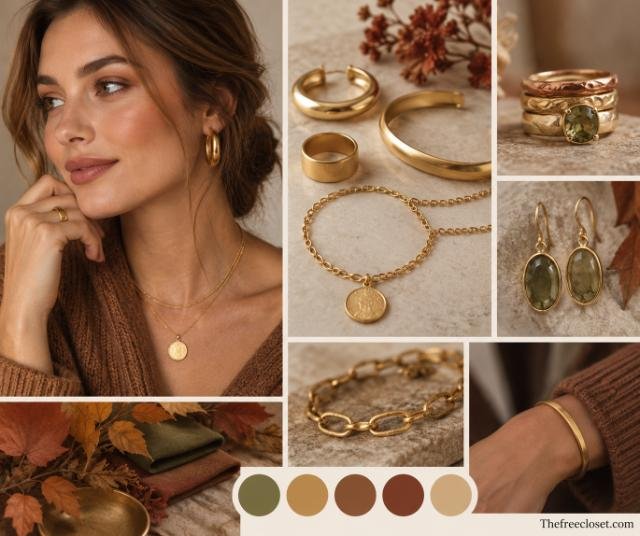
Warm and slightly subdued metals generally fit the palette naturally.
Good options include antique gold, brushed gold, bronze, copper, brass, and softer rose gold. Bright yellow gold may sometimes feel more intense than a muted or aged finish.
Mixed metals can also work, especially when the overall effect remains subtle.
For gemstones and decorative colors, consider amber, smoky quartz, warm turquoise, jade-like greens, tiger’s eye, muted coral shades, and earthy stones.
Scale matters too. Extremely reflective or highly ornate jewelry can create more visual intensity than the color alone suggests. Matte and brushed finishes often integrate more quietly.
Soft Autumn Makeup
Soft Autumn makeup tends to work best when it enhances the face without creating stark edges or excessive saturation.
The goal is not necessarily “natural makeup.” You can still wear noticeable color. The color simply tends to look more harmonious when it is warm-neutral and softened.
Foundation and complexion
Match foundation to your actual skin rather than choosing foundation according to your seasonal label.
A Soft Autumn classification does not automatically determine a specific foundation shade. Your complexion may be neutral, warm-neutral, golden-neutral, peach, or olive, and depth varies substantially between individuals.
Blush
Useful blush directions include:
- Muted peach
- Soft apricot
- Warm dusty rose
- Terracotta rose
- Browned peach
Highly blue-pink blushes and extremely vivid coral can create stronger contrast.
Eyeshadow
Soft Autumn offers a particularly versatile eye palette.
Try warm taupe, cocoa, caramel brown, bronze, olive, khaki, muted gold, mushroom, and softened copper.
Instead of a harsh black liner, espresso, chocolate brown, deep olive, or bronze-brown can provide definition while maintaining a softer overall effect.
Lip colors
Look for shades that contain warmth but are not excessively vivid:
- Cinnamon nude
- Warm rose
- Muted coral
- Terracotta
- Peachy brown
- Rosewood
- Soft brick
If a lipstick looks too bright when applied, try blotting it into a stain or selecting a slightly browner version.
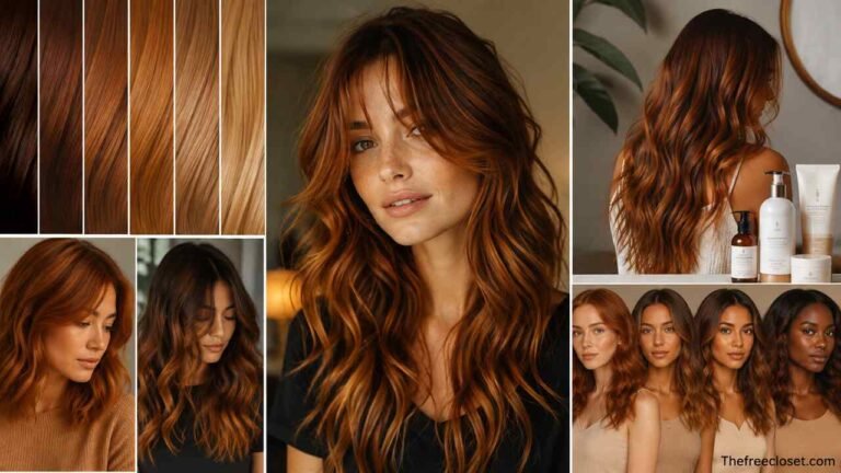
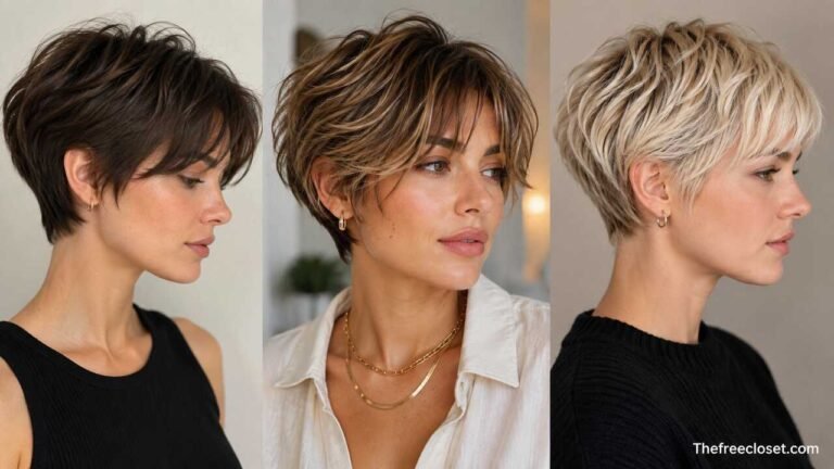
Best Hair Colors for Soft Autumn
Hair color usually looks most cohesive when it preserves the palette’s combination of warmth and softness.
Possible directions include warm light brown, hazelnut, caramel brown, honey brown, softly golden brunette, dark honey blonde, and subdued copper tones.
The underlying principle matters more than the shade name.
Very cool ash tones can remove warmth, while platinum blonde or blue-black can create significantly more contrast. Equally, an extremely vivid copper may become too saturated even though it is technically warm.
If you highlight your hair, blended highlights with moderate contrast may integrate more naturally than very pale streaks against a substantially darker base.
Hair color is also highly dependent on your starting shade, hair condition, skin tone, and desired maintenance, so seasonal analysis should be treated as one consideration rather than a substitute for professional color formulation.
Soft Autumn vs. Soft Summer
This is often the most difficult comparison because both palettes prioritize softness.
The main dividing point is temperature.
| Soft Autumn | Soft Summer |
| Neutral-warm | Neutral-cool |
| Olive | Soft blue-green |
| Camel | Cool taupe |
| Terracotta | Dusty mauve |
| Warm rose | Cool rose |
| Cream | Soft cool white |
| Cocoa | Cool charcoal |
| Muted teal | Dusty blue |
Soft Autumn tends to respond better to earthy warmth, while Soft Summer tends toward gray-blue and cool rose directions.
If both seem plausible, compare muted colors of similar depth rather than comparing completely different colors. For example, compare warm dusty rose with cool mauve or warm olive with cool gray-green.
That isolates temperature instead of accidentally testing several variables simultaneously.
Soft Autumn vs. True Autumn
True Autumn shares the warmth but generally tolerates greater richness and saturation.
Imagine a classic autumn landscape filled with pumpkin, rust, mustard, forest green, and rich brown. Those colors may suit True Autumn beautifully.
For Soft Autumn, imagine the same landscape covered by a slight haze.
The orange becomes terracotta. Mustard becomes muted ochre. Forest green becomes moss. Rich camel becomes softer beige-camel.
If unmistakably warm colors suit you but the richest versions feel overpowering, Soft Autumn may be worth investigating.
Soft Autumn vs. Deep Autumn
Deep Autumn is built around significantly greater depth.
Dark chocolate, deep olive, aubergine, dark rust, and other substantial earth tones can form a strong part of a Deep Autumn wardrobe.
Soft Autumn usually benefits from reducing that visual weight.
This distinction becomes particularly useful when shopping for neutrals. A very dark espresso coat might integrate beautifully into Deep Autumn coloring while a softer cocoa or warm taupe version may sit more naturally within Soft Autumn.
Individual depth still matters, however. Not every person classified as Soft Autumn needs exactly the same lightness or darkness.
How to Build a Soft Autumn Capsule Wardrobe
You do not need to replace an entire wardrobe after discovering your season.
Start with items worn closest to your face, because tops, scarves, jackets, eyewear, and jewelry usually have a greater visual relationship with facial coloring than shoes or trousers.
A practical starting capsule might contain:
- 2 cream or oatmeal tops
- 2 warm taupe or camel basics
- 1 sage or olive layer
- 1 muted teal piece
- 1 dusty peach or terracotta accent
- Cocoa or warm-brown footwear
- A camel, mushroom, or olive outer layer
- Brushed gold or bronze accessories
Then create combinations from those pieces before purchasing more.
This approach also solves a common wardrobe problem: buying individual flattering colors that do not coordinate with anything else.
A Better Way to Shop for Soft Autumn Colors
Do not rely solely on color names.
Retailers can call almost anything “sage,” “camel,” “rust,” or “taupe.” Two products with the same color name can have completely different undertones and saturation.
Instead, ask three questions:
Is it soft?
The color should usually appear somewhat dusty or subdued rather than brilliant.
Is it warm or warm-neutral?
Look for an earthy, golden, peach, brown, or olive influence rather than obvious icy blue undertones.
Is the intensity appropriate?
If you notice the garment before you notice your face, try a quieter version.
Keep several reliable pieces or physical swatches available while shopping. Comparing a questionable garment directly with a known flattering color is often easier than trying to remember a precise shade.
Common Soft Autumn Mistakes
One mistake is assuming every warm color works. Bright coral, intense orange, brilliant yellow, and saturated red may all be warm but still overwhelm a muted palette.
Another is turning Soft Autumn into an entirely beige wardrobe. Muted does not mean colorless. Olive, teal, terracotta, dusty coral, moss, warm rose, ochre, and softened turquoise can provide plenty of variety.
A third mistake is treating black as forbidden. If you enjoy black, keep it. You can reduce its effect near the face, pair it with softer colors, or simply wear it because it suits your personal style.
Finally, avoid determining your season from hair and eye color alone. Seasonal color analysis is fundamentally about the relationship between color and your overall coloring, not whether you match a predefined photograph.
Conclusion
Soft Autumn is best understood through two words: soft and warm.
Rather than collecting a rigid list of approved colors, look for the pattern behind the palette. Choose sage instead of vivid green, terracotta instead of brilliant orange, cocoa instead of stark black, and cream instead of optic white. Build outfits with blended contrast and use texture when you want additional visual interest.
Most importantly, treat seasonal color analysis as a practical styling framework rather than an absolute rule. Start with colors worn close to your face, compare shades in natural light, and gradually build a wardrobe around the muted warm colors that consistently work well for you.
Discover the latest fashion trends, home ideas, travel tips, and lifestyle inspiration at thefreecloset.com.
FAQ’s
Yes. Black is simply more intense and higher contrast than the core Soft Autumn palette. Cocoa, espresso, or deep warm brown may produce a softer effect near the face, but you do not need to eliminate black if you enjoy wearing it.
Yes, although softer whites such as ivory, oyster, ecru, and cream often integrate more naturally than brilliant optic white.
Absolutely. Muted teal, dusty turquoise, softened petrol, and subdued blue-green shades are particularly useful. Extremely icy or electric blues sit farther from the palette.
“Muted Autumn” is commonly used as another name for Soft Autumn. Terminology varies between seasonal color-analysis systems, so the characteristics of the palette matter more than the label.
Sage, olive, camel, warm taupe, mushroom, cream, cocoa, muted terracotta, dusty peach, warm rose, moss, caramel, and muted teal are strong starting points. The common denominator is softness combined with gentle warmth.
Soft Autumn is generally described as warm-neutral or neutral-warm. It belongs to the Autumn family but sits close to Soft Summer, so its warmth is typically subtler than True Autumn’s.