


Living room paint ideas directly impact home atmosphere, resale value, and emotional well-being. Strategic paint selections not only alter perceived space but also define aesthetic style and synchronize with furniture and lighting conditions. Homeowners seek living room paint inspiration to refresh, personalize, or completely reinvent their primary living area as it functions as the central gathering zone of the house.
What Are the Most Popular Living Room Paint Colors in 2025?

Interior color trends for 2025 focus on natural influence, psychological comfort, and timeless versatility. The most popular living room paint colors reflect both soothing simplicity and expressive individuality. These colors represent emotional well-being, nature-inspired aesthetics, and the desire to create a grounded yet stylish living environment.
Why Are Neutral Shades Timeless for Living Rooms?
Neutral shades such as beige, greige, taupe, soft gray, and warm white offer unmatched flexibility for styling living rooms. These tones form a subtle backdrop that allows furnishings, textures, and accessories to stand out. Neutrals help maintain spatial continuity, making them ideal for open-plan living rooms. Their calming effect stems from their ability to absorb and reflect light evenly, ensuring the room always feels warm, stable, and grounded regardless of decor changes.
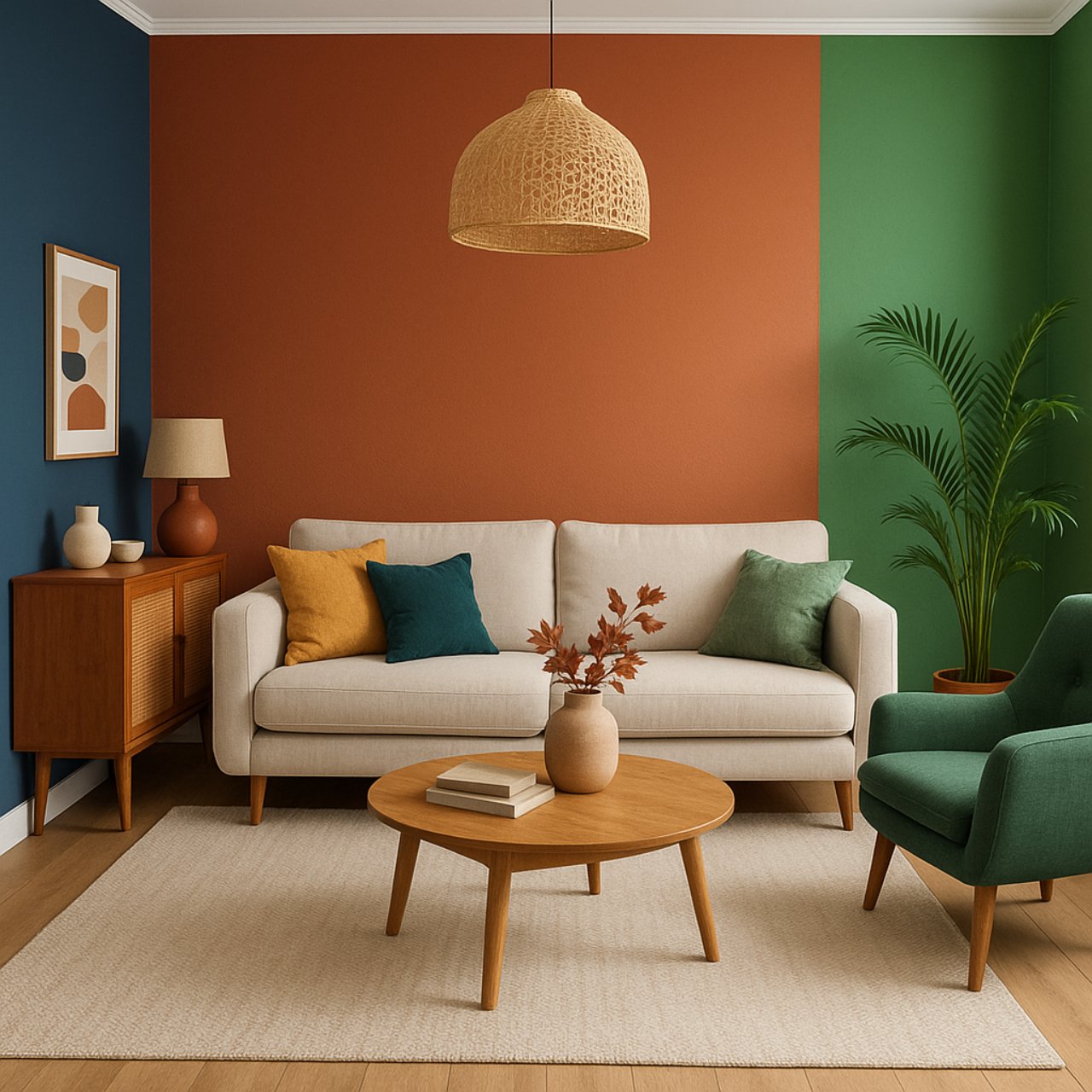
How Do Bold Colors Make a Statement in Modern Interiors?
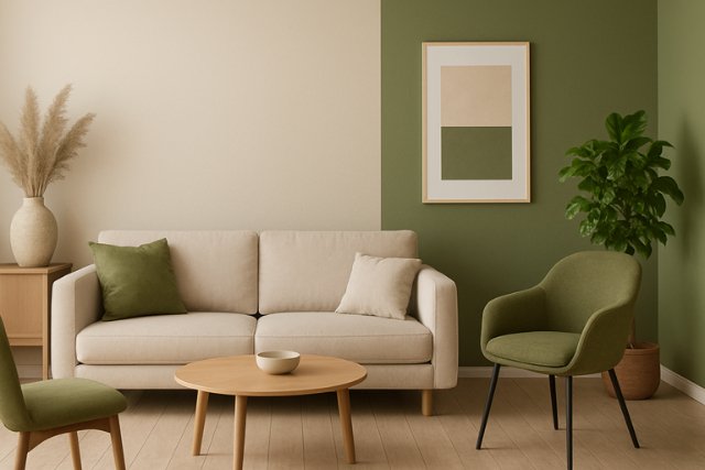
Bold colors like emerald green, navy blue, charcoal black, mustard yellow, and terracotta bring an expressive and confident tone to a living room. These colors serve as visual anchors that define character zones within the space. When applied as accent walls or across all four walls in carefully lit rooms, they enhance architectural features and work harmoniously with metals, dark wood, and statement lighting. These shades symbolize individuality and often appear in urban lofts, contemporary homes, and designer-forward interiors.
How Does Paint Color Affect Mood and Space Perception?
Paint color plays a critical role in shaping how a living room feels and functions. The choice of color influences mental states like tranquility, warmth, excitement, or focus. Colors with low saturation and high brightness tend to expand perceived space, while dark or high-saturation tones create intimacy and boundary. Effective use of paint color manipulates room dynamics, especially in small apartments or awkwardly shaped areas.
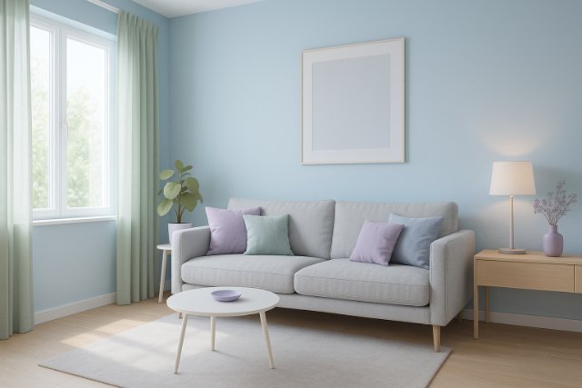
Which Living Room Colors Make Small Spaces Look Bigger?
Cool-toned, bright colors such as sky blue, pale sage, soft lavender, and icy gray reflect more natural and artificial light, thus opening up a room visually. These shades blur corners and edges, reducing visual constraints and expanding horizontal and vertical perception. When combined with minimal furniture and strategic lighting, these colors transform tight living spaces into breathable, inviting zones without structural changes.
What Colors Create a Cozy and Inviting Atmosphere?
Warm earth tones like cinnamon beige, butterscotch, clay pink, burnt amber, and muted gold make living rooms feel intimate and enveloping. These hues mimic natural materials and seasonal warmth, ideal for family gatherings and restful evenings. Applied to full walls or niche areas, warm colors soften shadows, absorb excess brightness, and offer psychological comfort, especially during cold seasons or under artificial lighting.
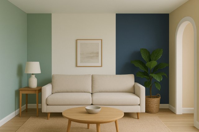
What Are the Best Two-color Combinations for a Living Room?
Two-color paint schemes offer visual sophistication by combining contrast and cohesion. These pairings can delineate functional zones in an open-plan living room, direct attention to design elements, or reinforce natural lighting effects. Properly chosen combinations support both aesthetic style and emotional tone.
How to Balance Contrast and Harmony With Paint Shades?
Contrast is achieved by pairing dark and light tones, such as ivory with olive green or charcoal gray with soft mustard, which emphasizes visual interest and draws attention. Harmony is maintained by selecting tones within the same hue family or neighboring hues on the color wheel. For example, beige with taupe or powder blue with steel produces seamless gradients that relax the eye. These strategies prevent visual fatigue and ensure a cohesive appearance throughout the space.
Which Color Pairings Work Best With Natural Light?
Natural light enhances the perception of color depth and purity. Color combinations like light almond and ocean blue or sage green and off-white adapt well to changing daylight by maintaining color integrity throughout the day. Blush pink and sand beige reflect warmth during sunset, while cream and soft green look serene in morning light. Pairings should match the room’s sun exposure direction for optimal aesthetic effect.
| Two-Color Combination | Mood Effect | Best Suited For |
| Soft Gray + Dusty Rose | Calm, modern elegance | Scandinavian or minimalist |
| Taupe + Olive Green | Grounded, organic warmth | Boho or rustic interiors |
| Navy Blue + Warm White | Crisp, nautical clarity | Coastal or transitional spaces |
| Beige + Soft Black | Sophisticated, balanced contrast | Modern classic or luxe styles |
| Sage + Cream | Serene, inviting energy | Light-filled urban apartments |
Color pairing enhances visual depth, unifies furniture schemes, supports mood-driven design strategies, and allows for easy decor switching throughout the year.
How Do You Choose the Right Paint Finish for a Living Room?
Paint finish determines light reflection, surface durability, and cleaning ease. The choice of finish should depend on the room’s traffic level, design style, wall condition, and functional usage. A poor finish can highlight flaws, complicate maintenance, or create unwanted glare.
What’s the Difference Between Matte, Satin, and Gloss?
- Matte Finish provides a non-reflective, velvety surface that conceals wall imperfections. It suits formal and quiet living rooms with minimal traffic.
- Satin Finish has a subtle sheen, offering durability and easier cleaning without looking glossy. It works best for active households and family zones.
- Gloss Finish delivers high shine, highlighting surface details and increasing visual contrast. Due to its reflectivity, it’s best for trim, molding, or accent details rather than entire walls.
Which finishes are easiest to maintain in high-traffic areas?
Satin and eggshell finishes strike the right balance between aesthetics and functionality. These finishes resist scuffs, stains, and fingerprints, making them ideal for households with children, pets, or frequent guests. Semi-gloss, while more reflective, provides added durability for baseboards and corners subject to daily wear.
What Living Room Paint Ideas Work With Different Design Styles?
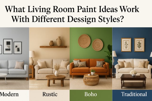
Each design style embraces a specific color philosophy that reinforces its character and emotion. Paint choices must align with style traits such as material type, formality, furniture profile, and natural vs. artificial texture. Consistency ensures the room feels authentic and visually unified.
How Do Minimalist and Scandinavian Interiors Use Color?
Minimalist and Scandinavian interiors emphasize functionality, clean lines, and openness. These styles rely on white, ivory, soft beige, ash gray, and muted blue to maintain brightness and simplicity. Accent elements like black window trims, monochrome artwork, or stone textures provide minimal contrast to avoid visual noise. These schemes make rooms feel structured, expansive, and mentally uncluttered.
Which Paint Schemes Suit Traditional or Farmhouse Living Rooms?
Traditional and farmhouse interiors favor warm, comforting hues that reflect historical charm and handcrafted appeal. Common choices include cream, dusty blue, forest green, maroon, and oatmeal. These tones complement wood furniture, antique pieces, and vintage-inspired fabrics. Paint is often paired with paneling, shiplap, or molding to further enhance visual structure and nostalgia.
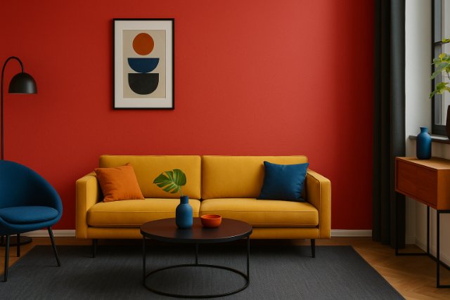
What Bold Palettes Define Modern and Eclectic Styles?
Modern and eclectic designs invite bold experimentation with rich, saturated hues. Colors like burnt orange, eggplant, teal, fuchsia, and jet black allow homeowners to express uniqueness. When combined with metallic finishes, textured wallpapers, or open shelving, these colors tell visual stories and break conventional design rules. Eclectic styles benefit from layered color blocking and curated contrast, emphasizing personal flair over uniformity.
How Can Accent Walls and Textures Elevate a Living Room?
Accent walls and paint textures serve as design focal points. These visual anchors guide the eye, frame key furniture pieces, and offer style contrast without full-room commitment. Textural techniques and accent shades add depth, movement, and tactile interest to otherwise flat walls.
Should You Use Dark or Patterned Paint for an Accent Wall?
Dark paints such as deep navy, emerald, or black provide dramatic grounding, especially behind large furniture like sofas or media units. Patterned paints with geometric stencils, floral prints, or metallic overlays inject character and artistic flair. Accent walls should highlight a central visual point and receive ample light to avoid making the space feel boxed in.
How Do Techniques Like Color Blocking or Ombre Work?
- Color Blocking involves separating sections of the wall into defined geometric shapes painted in contrasting colors. It suits modern interiors and emphasizes architectural symmetry.
- Ombre Painting transitions from a deep hue at the base to a lighter version at the top, creating vertical movement and a serene visual gradient. It requires blending skill and painter’s tape for neat application.
Both techniques infuse creativity into the space and act as stand-alone design statements.
What Are Eco-friendly and Low-voc Living Room Paint Options?
Eco-friendly paints are engineered to reduce environmental harm and improve indoor air safety. These formulations contain little to no volatile organic compounds (VOCs), which are harmful gases released by traditional paints.
Why is Sustainable Paint Important for Health and Environment?
Sustainable paints reduce toxic emissions and improve indoor air quality, protecting residents from respiratory problems and allergic reactions. Environmentally, these paints minimize carbon footprints, waste production, and resource depletion. Choosing sustainable options contributes to healthier homes and responsible consumer behavior.
Which Brands Offer the Best Eco-friendly Choices?
- ECOS Paints: Non-toxic, zero-VOC, ideal for sensitive households.
- Benjamin Moore Natura: Allergy-friendly, with excellent coverage and durability.
- Clare Paint: Low-VOC, designer palettes, and recyclable packaging.
- Sherwin-Williams Harmony: Features odor-reducing technology and anti-microbial properties.
- Behr Premium Plus: Mold-resistant, low odor, suitable for budget-conscious eco-conscious decorators.
These brands offer premium finishes, diverse color selections, and health-conscious compositions suitable for sustainable interiors.
How Much Does It Cost to Paint a Living Room?
Painting costs vary depending on multiple factors including room size, paint type, complexity, and labor. The total cost typically includes surface preparation, material, and cleanup. Knowing the components helps budget efficiently and decide between DIY and professional help.
What Factors Affect the Overall Price?
Key factors include:
- Room Size: Larger rooms require more paint and labor hours.
- Wall Condition: Prep work for damaged, textured, or wallpapered walls increases cost.
- Paint Quality: High-end or eco-friendly paints are more expensive per gallon.
- Finish Selection: Glossy finishes may need more coats, adding time and expense.
- Accent Work: Patterns, multiple colors, and textured finishes involve extra skill.
| Factor | Impact on Cost |
| Room Size | Increases gallon and labor needs |
| Paint Brand/Type | Premium and eco brands cost more |
| Finish | Gloss/satin increase labor time |
| DIY vs Pro | Labor accounts for 60-70% total |
Should You Hire a Professional Painter or Diy?
DIY painting is cost-effective and provides creative control but demands time, precision, and surface knowledge. Professionals deliver speed, surface prep expertise, and uniform results, especially in larger rooms or when using complex finishes. Hiring a painter prevents uneven coats, poor line work, or finish incompatibility that may lead to costly redos.
What Are Common Mistakes to Avoid When Choosing Living Room Paint?
Common mistakes include selecting paint in artificial lighting only, ignoring undertones, mismatching with furniture, and skipping proper testing. Avoiding these pitfalls ensures long-term satisfaction and coherence.
Why Does Lighting Matter When Testing Paint Samples?
Lighting significantly alters paint appearance. Natural daylight reveals true color, while warm incandescent or cool LED lights distort hue. Paint should be tested on different walls and observed at various times of day to capture changes in color temperature and brightness.
How Do You Avoid Clashing With Furniture and Décor?
Every paint choice should consider the room’s fixed features such as flooring, curtains, rugs, and upholstery. Undertones in these elements must align with wall paint to prevent dissonance. Choosing neutral base walls allows greater flexibility with changing accessories and seasonal décor.
Conclusion
Living room paint ideas define atmosphere, influence mood, and enhance interior harmony. From trending colors and eco-friendly brands to style-specific palettes and accent wall techniques, every decision shapes spatial perception and comfort. Strategic paint choices elevate aesthetic appeal and property value, while also supporting personal expression, environmental responsibility, and design versatility.
FAQ’s
Soft neutrals like light gray, greige, or warm white appeal to the widest audience and boost resale value.
Pale tones like icy blue, soft lavender, and clean white reflect more light and create a spacious feel.
Warm tones suit cozy, traditional spaces. Cool tones fit modern, airy designs. Match with lighting and furniture tones.
Yes. Use matte on walls, satin on trim, and gloss on doors or accents for a balanced and practical effect.
Apply large swatches on multiple walls. Observe at different times of day. Compare with existing furniture and décor.
Use a single high-quality neutral in a matte or eggshell finish. Focus on repainting trim and one accent wall for effect.
Yes, if used strategically. A dark accent wall paired with lighter surrounding walls adds depth and intimacy.
Repainting every 5 to 7 years maintains freshness, especially in high-traffic or sun-exposed areas.


