

Living room color trends in 2025 reflect a global shift toward authenticity, emotional resonance, and tactile design experiences. Homeowners now seek expressive hues that communicate identity, paired with textural depth and psychological warmth. These color movements integrate both aesthetic and functional values across residential spaces.
What Living Room Colors Are Trending in 2025?
Color choices in 2025 are driven by a desire to create emotionally resonant, personalized, and sensory-rich environments. Homeowners are moving away from flat, impersonal tones and leaning into layered palettes that evoke calm, vibrancy, and individuality. The trending palette includes earthy browns, warm terracotta, expressive reds, rich jewel tones, and nuanced neutrals. These colors reflect changing cultural attitudes toward home spaces-where identity, comfort, and emotional well-being are prioritized over uniformity and convention. Designers are responding by curating palettes that blend past and future sensibilities, resulting in cohesive yet striking living room experiences.
Browns and Earth Tones
Neutrals 2.0

Neutrals are evolving beyond basic white and gray. Soft off-whites, greiges, and sun-washed yellows offer nuanced serenity. These shades act as restful backdrops, making colorful furnishings and textures more prominent.
Soft Greens and Mellow Blues
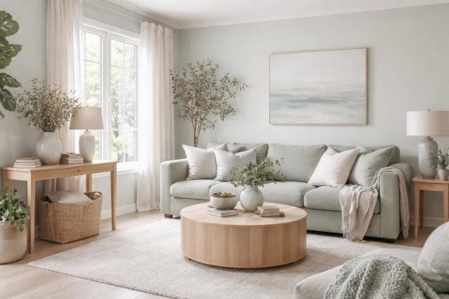
Muted greens and pale blue-grays bring calm energy. Shades like sage, eucalyptus, and mist blue offer visual tranquility and are especially favored in smaller or light-limited living rooms.
Why Are Earthy Browns and Terracotta Gaining Popularity?
Earthy browns and terracotta are dominating color trends in 2025 because they offer a deep connection to nature, evoke emotional security, and harmonize effortlessly with other tones. These colors ground the living room in warmth and realism, acting as a visual and psychological anchor in a time of cultural and economic instability. Terracotta, in particular, has a heritage-rich aesthetic that brings a handmade, sunbaked feel to the space, evoking Mediterranean, Southwestern, and rustic global inspirations. As homeowners seek comfort through colors, earthy browns deliver timeless elegance while allowing freedom in layering vibrant accents and textures.
Design Flexibility

Brown tones serve as base colors for layering additional hues like green, ochre, or rust. This allows both minimalist and maximalist interpretations, depending on the furniture and texture palette used.
Organic Textures
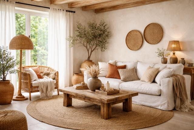
When paired with natural materials like rattan, wood, and jute, earthy tones amplify the sensory feel of a space. These materials echo the aesthetic of Mediterranean, Bohemian, and Japanese interiors.
How is Red Being Used as an Accent in Living Spaces?
In 2025, red is being used strategically and unconventionally to elevate visual interest without dominating a room. The shift is guided by the “unexpected red theory,” which embraces placing red in small, unexpected areas to break the monotony and create surprise. This approach disrupts neutral-heavy palettes, encouraging movement and attention. Designers are increasingly using red in furniture legs, lighting details, and window trims to guide the eye and inject personality. The strategic use of red revitalizes static interiors, turning passive spaces into expressive narratives of style and intent.
Unexpected Red Theory

Red is introduced in small areas such as a window frame, lamp base, or artwork edge-to create a deliberate surprise. This design trick adds energy without overwhelming the room.
Accent Layers

Cushions, throws, and patterned textiles in varying shades of red such as scarlet, burgundy, and cherry are intentionally layered throughout the space to create depth and warmth. These rich accents function as transitional color elements, effectively linking bold hues with more muted, neutral tones. By incorporating these reds in soft furnishings, the design achieves a cohesive visual flow, softening contrasts between vibrant and subdued areas without overwhelming the overall palette.
Which Jewel Tones Are Influencing Maximalist Living Room Design?
Jewel tones are central to 2025’s maximalist living room design, infusing spaces with depth, drama, and richness. These tones are not just decorative-they symbolize bold individuality, storytelling, and intentional luxury. Used in layered schemes, jewel tones invite tactile exploration and visual density, hallmarks of the maximalist philosophy. They also harmonize beautifully with metallic finishes and complex textures. The use of deep emeralds, sapphires, and plums enables homeowners to design spaces that feel expressive, layered, and emotionally resonant.
Emerald Green
Emerald green offers regal undertones and pairs beautifully with brass, velvet, and dark wood. It enhances indoor foliage and adds a lush botanical energy.
Sapphire Blue
Sapphire evokes calm yet powerful emotion. It introduces clarity and serenity while supporting bold statements through furniture or wall color.
Amethyst Purple
Purple adds mystique and luxury, especially in living rooms with moody lighting. It pairs well with metallics and textured fabrics like silk or velvet.
Garnet Red
Garnet introduces depth and warmth. It helps unify warm palettes and makes small spaces feel more intimate and dramatic.
What Neutrals Remain Timeless-and How Are They Evolving?
Timeless neutrals in 2025 have shifted from stark and sterile to soft, lived-in, and emotionally grounding. These evolved neutrals embrace imperfection, warmth, and subtle complexity, moving away from flat white and grayscale tones. They act as emotional backdrops that adapt to bold colors and textured layers without competing. Their adaptability makes them perfect for renters, transitional homes, or those seeking to add personality without overwhelming the senses. Neutrals in 2025 celebrate tone, variation, and the comfort of subtlety.
Greige

Greige, a sophisticated blend of gray and beige, introduces subtle depth and warmth to minimalist interiors. Its unique undertone shifts between cool and warm depending on the surrounding light natural daylight enhances its gray hues, while artificial or ambient lighting reveals its beige character. This dynamic quality allows greige to adapt effortlessly throughout the day, making it a versatile choice for living rooms where lighting changes frequently. The neutral foundation supports both modern and classic decor, while still adding complexity through its chameleon-like behavior in different environments.
Sun-Washed Neutrals

Sun-faded tones such as sandstone and pale ochre help bring a sense of outdoor warmth into interior spaces. These colors mimic the gentle, weathered effect that occurs when natural materials are exposed to prolonged sunlight, creating a soft, lived-in aesthetic. The subtle fading suggests timeworn surfaces, adding depth and authenticity to rooms while maintaining a calm, earthy atmosphere. These hues evoke landscapes shaped by nature, helping interiors feel more organic, relaxed and connected to the outdoors.
Soft Taupe

Taupe provides a stabilizing foundation for interior spaces by offering a balanced aesthetic combining the sleek, understated appeal of modern gray tones with the comforting warmth of traditional brown hues. It grounds a room with elegance and neutrality, creating visual harmony without adding visual weight or making the space feel dark or enclosed.
How Can You Effectively Use Color Drenching or Color Blocking?
Color drenching and blocking are advanced painting techniques that dramatically reshape the perception and function of living rooms. These methods go beyond standard accent walls to achieve immersive or segmented design experiences. Color drenching offers a monochromatic, immersive space where light and shadow define depth. In contrast, color blocking uses sharp divisions to guide flow and purpose within open-concept or multifunctional rooms. Both techniques enable bold creativity while maintaining balance and cohesion.
Color Drenching
Color drenching involves painting walls, ceilings, trim, and even furniture in the same color. This technique creates depth, unity, and mood-especially effective with jewel tones or rich neutrals.
Color Blocking
Color blocking applies two or more distinct colors in geometric divisions. Living rooms use this to create zones (e.g, reading corner vs. entertainment area) or highlight architectural elements.
Vertical and Horizontal Play
Using color at different heights-half-wall treatments or painted ceilings-adds architectural interest without renovation. It enables illusion-based space manipulation.
Best Color Combinations
Combos like emerald and blush, ochre and grey, or cobalt and cream work well for color blocking due to their contrast and visual harmony.
What Materials and Textures Best Complement Trending Colors?
The success of 2025’s trending colors hinges on how they interact with materials and textures. Tactile surfaces elevate paint choices from flat applications to fully sensorial design systems. Soft fabrics, warm metals, and organic textures work in synergy with warm browns, vibrant reds, and jewel tones, creating a unified and inviting atmosphere. These textures anchor the visual experience in touch and feel, transforming visual color theory into lived-in comfort.
Bouclé
Bouclé fabric adds soft texture to neutral palettes. Off-white bouclé sofas ground earthy color schemes while remaining visually light.
Brushed Brass
Brushed brass accents reinforce jewel tones by adding glamour. It pairs beautifully with emeralds and amethysts, especially in lighting or hardware.
Natural Wood
Natural and raw wood grains highlight browns and terracottas. They introduce visible organic patterns that echo nature.
Woven Textiles
Wool, jute, and cotton add layers of texture. These materials support Mediterranean or Southwestern palettes, creating an inviting and grounded atmosphere.
| Material | Best Paired Colors | Textural Function |
| Bouclé | Off-white, camel, soft greige | Adds softness and modern curvature |
| Brushed Brass | Emerald, plum, navy | Adds shine and visual warmth |
| Raw Wood | Terracotta, brown, sage | Emphasizes natural, biophilic design |
| Wool & Jute | Ochre, olive, charcoal | Grounds color with tactile weight |
Soft textures like bouclé and natural wood balance the intensity of 2025’s rich color palette, providing visual and sensory coherence across furniture and decor.
What Are the Pros and Cons of Trending Living Room Colors?
Color trends in 2025 bring emotional depth and personality, but may challenge those seeking timeless minimalism or resale-safe designs. While they offer exciting creative expression, these trends require thoughtful planning to maintain balance and long-term appeal.
Pros
- Offer highly personalized aesthetics
- Pair well with warm lighting and textures
- Create cozy, emotionally resonant spaces
- Enable layered, artistic design statements
Cons
- Some jewel tones may darken smaller rooms
- Bold choices may not appeal to all buyers
- Repainting can be labor-intensive when trends shift
- Require thoughtful pairing with furniture and material
Will These Trends Continue Into 2026?
Trend analysts suggest that 2025’s living room colors will evolve, not disappear. Earth tones and expressive reds are expected to deepen in saturation. Neutrals will likely gain even more warmth, reflecting broader shifts toward emotional wellness and nature-centric design. Jewel tones will remain staples of maximalist expression, while unexpected accents will diversify with new placements. As a whole, 2025’s palette is not just a momentary trend-it signals a foundational shift in how homeowners use color to tell stories and shape well-being.
Conclusion
Living room color trends in 2025 represent a shift toward human-centered, emotionally expressive environments. Homeowners gravitate toward colors that feel personal yet elevated, grounded yet experimental. From terracotta to emerald, and bouclé to brass, these elements combine to reflect not just style, but identity.
FAQ’s
Browns, terracotta, emerald green, sapphire blue, garnet red, off-white, greige, and soft green are the most prominent.
Earthy browns offer more emotional warmth, organic resonance, and cultural influence compared to flat beige tones.
Jewel tones bring richness and visual depth, perfect for layering textures and curating bold design statements.
The “unexpected red theory” utilizes red in non-obvious placements to break visual monotony and create focal intrigue.
Neutrals are evolving into sun-faded, off-white, and greige tones that provide warmth, depth, and versatility.
Color drenching involves painting all architectural surfaces the same color to create immersive, tonal living spaces.
Bouclé, jute, raw wood, and brushed brass amplify the mood of trending colors while adding tactile dimension.
Soft greens, muted yellows, and warm neutrals like greige or taupe help maintain airiness while ensuring visual comfort.