

Introduction
Balanced living room color ideas using grey, green, beige, and blue tones provide a harmonious foundation for interiors that prioritize tranquility, cohesion, and modern elegance. These four hues derive from natural elements stone, foliage, sand, and sky making them ideal for biophilic and restorative design principles. When curated together, these tones support mood stability and spatial fluidity, allowing homeowners to create personalized yet timeless interiors. Their compatibility extends across materials, lighting types, and textures, offering unmatched versatility for both open-concept layouts and smaller living rooms. This article offers a detailed guide on how to combine these colors effectively to enhance comfort, functionality, and emotional balance in interior spaces.
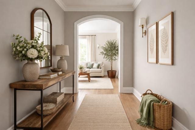
Best Beige Tones for a Calm, Cozy Living Room
Beige serves as a foundational hue in interior design, offering both warmth and neutrality. Unlike stark white, beige introduces soft undertones that enrich a room’s atmosphere and make it feel more lived-in and welcoming. It reflects natural light subtly, enhances spatial harmony, and supports a multitude of secondary colors. Beige tones create a sense of tranquility, especially when paired with nature-inspired hues like green, blue, and grey. Choosing the right beige tone can transform a living room into a welcoming, serene environment that suits both traditional and modern design principles. A carefully chosen beige paint anchors the visual design and serves as a bridge between cooler and warmer tones, allowing for more versatile layering with textures, materials, and accent hues.
Which Beige Tones Work Best with Green or Blue Accents?
Beige becomes more versatile when thoughtfully paired with accent colors like sage green or soft blue. Selecting the right undertone allows the beige to act as a neutral bridge between cool and warm elements, avoiding visual dissonance and maintaining cohesion across a color palette.
Pale Oak

Pale Oak is a greige an elegant combination of grey and beige with subtle pink undertones. This prevents it from appearing flat or lifeless and helps the room maintain visual interest without leaning into loudness. It adapts easily to both cool and warm environments, making it ideal for spaces that include green or blue accents. Pale Oak supports blue-gray or olive green tones by softening stark contrasts and enhancing cohesion. Its versatility makes it suitable for walls, ceilings, or even cabinetry in color-balanced environments.
Soft Beige

Soft Beige leans slightly creamy and introduces a natural glow to any room. It feels gentle under most lighting conditions, allowing it to adapt to changes in the environment throughout the day. When paired with dusty green or foggy blue, this tone enhances visual warmth without overpowering. It works particularly well in living spaces with ample natural light and contributes to a gentle, earthy aesthetic. The softness of this beige prevents harsh transitions and supports restful interior experiences.
How to Use Sage Green in Modern Living Rooms?
Sage green embodies the principles of biophilic design, connecting indoor environments with natural elements. Its calm, dusty tone mimics vegetation and organic scenery, helping occupants feel relaxed and centered. In modern interiors, sage green functions as a base color or a secondary layer that introduces depth and serenity without overwhelming the space.
Warm Sage

Warm Sage includes undertones of yellow or olive, which bring softness to cool northern light and add a golden or earthy tint to the room. It is ideal for main walls, cabinetry, or drapery in rooms that lack warmth. The addition of warm sage harmonizes with beige walls and pale wooden floors, creating a cohesive design. Warm Sage also interacts beautifully with warm white light, enhancing the coziness of a space.
Sage in Textiles and Furniture

Sage green performs exceptionally well in textiles such as upholstery, cushions, and curtains. These elements allow layering and color testing without long-term commitment. Fabric textures in sage help introduce subtle contrast within the muted color palette. A sage green sofa or set of curtains adds dimension and contributes to the biophilic effect without crowding the visual space.
Which Grey Tones Pair Well with Beige and Green?
Grey tones can either enrich or detract from a color palette depending on their undertones. Selecting greys that lean warm or soft ensures they complement rather than clash with beige and green. Using overly cold or flat greys can make a room feel sterile, whereas the right warm greys contribute to a grounded, elegant feel.
Foggy Gray
Foggy Gray introduces taupe and violet undertones, allowing it to sit comfortably next to beige and green elements. This grey adds visual interest and maintains warmth, preventing interiors from feeling clinical or stark. It is especially useful in transitional spaces like hallways or secondary walls where color balance needs to be seamless.
Greige

Greige fuses grey with beige and offers a chameleon-like quality. It adjusts to surrounding colors and lighting conditions, often changing subtly throughout the day. Greige functions well on expansive wall spaces or integrated features like fireplaces and shelving units. Its neutral nature makes it ideal for interiors that want flexibility in layering cool and warm elements.
French Gray

French Gray contains traces of blue and green, giving it an aged, vintage appeal. Its softness makes it suitable for trims or accent walls, especially in living rooms that aim to balance modern design with nostalgic elements. French Gray works beautifully with both matte and satin finishes, enhancing its versatility across multiple surfaces.
What Are the Most Soothing Blue Shades for Walls?
Blue is universally recognized for its calming influence and its ability to create a sense of openness, serenity, and mental clarity within interior environments. The right shade of blue on walls can make a room feel peaceful, breathable, and emotionally balanced. Blue hues engage the parasympathetic nervous system, which is associated with rest, calm, and healing. When used thoughtfully, soft blue tones can serve as either a dominant base color or a gentle accent to support other muted or nature-inspired palettes such as beige, sage green, and soft greys.
Soothing blues typically share three key characteristics: low saturation, grey or green undertones, and a matte or eggshell finish. These attributes reduce visual harshness, support natural lighting conditions, and align with both traditional and modern design philosophies focused on comfort and mental well-being.
Sky-Faded Blue
Sky-Faded Blue mirrors the appearance of a late-afternoon sky filtered through haze. This gentle tone sits between a powder blue and a desaturated periwinkle. Its subtle vibrancy keeps it from feeling dull, while the cool undertone prevents overstimulation. Sky-Faded Blue works exceptionally well in rooms designed for introspection such as reading nooks, meditation areas, or cozy dens. When paired with light beige or warm ivory trim, this color enhances natural light and extends the perceived height of ceilings.
Misty Horizon
Misty Horizon is a blue-grey tone with strong mineral characteristics. It takes its inspiration from fog rolling over coastal cliffs or mountain ridges. This shade has a sophisticated, grounded aesthetic, making it ideal for large wall surfaces in modern, minimalist living rooms. Misty Horizon supports color companions like muted sage, warm taupe, or brushed nickel. Its dual character both cool and comforting enables it to transition smoothly across daylight and artificial lighting without changing mood drastically. Use it in open-concept spaces to achieve consistency and elegance.
Blue Smoke
Blue Smoke is a modern, muted blue with slate undertones and a touch of lavender grey. It creates a whispery softness on walls that encourages stillness and quiet focus. This color performs especially well under indirect or diffused light, making it perfect for spaces with north-facing windows. Blue Smoke integrates naturally into Scandinavian, Japandi, or transitional interiors, where the emphasis lies on tonal layering and simplicity. Use it as a background color for framed art or floating shelves to allow decorative elements to breathe visually.
Arctic Blue Mist
Arctic Blue Mist introduces a pale, almost translucent blue with barely-there silver undertones. It’s ideal for small rooms or spaces where you want to maximize natural light while maintaining a cool, airy atmosphere. Unlike icy blues that can feel sterile, Arctic Blue Mist contains a balancing hint of warmth that prevents it from becoming clinical. It pairs well with whitewashed woods, soft blush accents, or pale sage details. This shade is particularly effective in bathrooms, hallways, or minimalist-style living rooms where tranquility is prioritized.
Summary Table of Soothing Blue Shades for Walls
| Blue Shade | Undertones | Ideal Uses | Best Pairings |
| Sky-Faded Blue | Soft grey, violet | Reading corners, ceilings | Light beige, ivory |
| Misty Horizon | Grey, mineral tones | Large wall spaces, open layouts | Sage green, warm taupe |
| Ocean Veil | Green-grey base | Bedrooms, quiet lounges | Driftwood, brass, natural linen |
| Blue Smoke | Slate, lavender grey | Scandinavian and Japandi designs | White oak, floating shelves, framed art |
| Arctic Blue Mist | Silver, icy warmth | Bathrooms, hallways, small rooms | Whitewashed wood, soft blush, pale sage |
Can All Four Colors Be Combined in One Room?
Integrating grey, green, beige, and blue requires strategic placement and tone coordination. These colors form a nature-inspired palette that feels layered and emotionally balanced when used correctly. The balance between cool and warm tones should feel effortless, not forced.
Color Hierarchy Strategy
- Foundation: Beige or greige on walls or ceilings provides a calming base.
- Accent: Sage green on feature walls or large furniture introduces softness.
- Contrast: Grey on trim or shelving creates structure and definition.
- Highlights: Blue in rugs, cushions, or drapes adds airiness and interest.
Repetition of Undertones
Use warm or cool undertones consistently across materials like wood, metals, and textiles. This prevents the room from feeling disjointed and helps create visual flow. Harmonious undertones build a cohesive, fluid aesthetic from corner to corner.
How Do Lighting Conditions Affect Color Appearance?
Lighting dramatically alters how paint colors are perceived. Direction and temperature of light influence whether a color feels warm, cool, bright, or muted. North-facing rooms tend to make colors feel cooler, while south-facing rooms add warmth.
Best Performing Tones in Low-Light Rooms
- Warm Greige (Pale Oak): Enhances light reflection without starkness.
- Dusty Sage: Maintains color clarity in variable lighting.
- Duck Egg Blue: Amplifies available light without glare and feels serene.
Using lighter finishes and reflective surfaces also helps maximize perceived brightness in dim spaces.
How to Balance Warm Beige and Cool Blue?
Juxtaposing warm and cool tones requires transitional elements to maintain visual harmony. Without transitional hues, the contrast between warm and cool can appear abrupt or clash visually.
Neutral Bridges
- Trim: Taupe or mushroom-colored trims help bridge warm and cool tones.
- Flooring: White oak or light ash floors unify the palette subtly.
- Materials: Brushed brass, rattan, or walnut introduce tactile warmth that makes the space feel balanced.
These materials help stitch together the temperature disparity between cool blue and warm beige without compromising the intent of either color.
What Are the Best Accent Colors with These Tones?
Muted palettes benefit from small doses of richer hues to add personality and elevate the overall design. Accent colors create moments of focus and help personalize otherwise neutral designs.
Accent Colors
- Mauve or Lavender: Enhance greens and greys with subtle contrast and a hint of romanticism.
- Soft Gold: Adds richness and reflects warm light elegantly through fixtures and accessories.
- Blush Pink: Introduces a soft warmth that balances cool elements and complements beige.
Accents should be repeated in more than one area to maintain consistency and visual logic.
What Paint Finishes Enhance This Palette?
Paint finish controls light reflection and surface texture, which affect the final ambiance of the room. Finish type also influences how a color will look once dry and installed.
Recommended Finishes
- Matte: Ideal for soft, muted walls that encourage tranquility and reduce glare.
- Satin: Suitable for trims and moldings where a touch of light reflection enhances depth.
- Velvet/Eggshell: Offers durability and subtle sheen, making it ideal for feature walls or built-ins.
Avoid gloss finishes as they reflect too much light, creating visual tension in serene spaces.
How to Design for an Open Concept Space?
Open layouts require color zoning and flow to prevent visual monotony. Color transitions must be fluid yet distinct to define functional areas while maintaining openness.
Zoning Techniques
- Color progression: Shift from beige in the living room to sage in the dining area for spatial differentiation.
- Trim consistency: Unify all zones with matching baseboards, door frames, and ceiling paint to visually tie the spaces together.
- Accent color repetition: Carry blue or grey through rugs, cushions, and light fixtures across all sections to maintain connection.
How to Test and Layer Paint Effectively?
Paint behaves differently depending on its location and surrounding finishes. Effective testing ensures the chosen color performs as expected once applied.
Testing Strategy
- Use 12×12 inch swatches minimum to get a true sense of color.
- Apply on multiple walls to test light impact throughout the space.
- Observe changes across day and night cycles to ensure consistency.
- Pair swatches with flooring and fabric samples to simulate final design context.
Which Textures Complement Grey, Green, Beige, and Blue Walls?
Texture prevents muted tones from feeling lifeless. Visual and tactile variety enhances depth and encourages sensory engagement with the space.
Recommended Texture Pairings
- Fabrics: Washed linen, boucle, velvet for comfort and variety.
- Woods: Driftwood, white oak, walnut for tonal contrast and natural grounding.
- Metals: Brushed nickel, antique brass, matte black to add sophistication and contrast.
Layering textures adds nuance and prevents a neutral palette from becoming monotonous.
Can a Statement Be Made Without Bold Colors?
Strong design does not rely on saturated tones. Layering, contrast, and structure create drama and interest within muted palettes without overwhelming the senses.
Subtle Drama Techniques
- Contrast: Charcoal trim on beige walls creates clear visual boundaries.
- Layering: Sage furnishings on foggy blue backgrounds create dynamic color play.
- Material Shine: Glossy decor or metallic lighting against matte walls introduces luxurious contrast.
Thoughtful contrast replaces the need for bold hues while enhancing emotional richness.
Conclusion
Beige, green, grey, and blue establish a deeply tranquil and versatile living room foundation. These nature-based hues balance light, depth, and mood while promoting visual cohesion. When layered with texture, lighting, and thoughtful finishes, these tones create modern sanctuaries that are emotionally restorative and design-forward. Their versatility suits open-concept layouts, small spaces, and both traditional and contemporary aesthetics. Every color works in harmony with the others, allowing the user to build a cohesive yet distinctive interior that evolves with time and taste.
FAQ’s
Pale Oak provides the best balance with sage green due to its greige base and subtle undertones.
Yes, sage green can serve as a base while soft blues act as accents for depth.
Foggy Gray with taupe undertones ensures warmth and balance.
Dusty and muted blue tones are timeless and remain staples in calm interior design.
Choose white oak or light ash flooring for a seamless connection between all color families.
Matte or velvet finishes enhance the ambiance without glare.
Through thoughtful layering, strategic contrast, and varied texture applications.
Yes, especially when lighter tones like duck egg blue or warm greige are used to enhance light reflection.